 |  |  |  |
|---|
 |  |  |
|---|
 |  |  |  |
|---|---|---|---|
 |  |  |  |
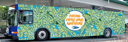
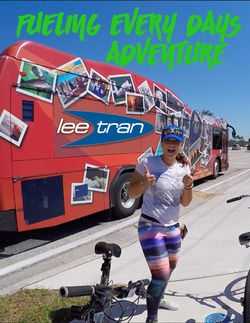
LeeTran Public Transportation hosted a competition between the FGCU Digital Media Design II students to create a campaign consisting of three commercials, three posters, and other creative components. The Fueling Every Day's Adventure campaign that I created was chosen as the winner. The main component of the “Fueling Every Day’s Adventure” campaign is to target the choice rider audience, ages 17+, inspiring them to bring the fun back into riding the bus. The inspiration behind the campaign came from looking at the emotions associated with riding the bus in youth.
When young, often the bus is for field trips that create a sense of wonder and awe, traveling to the next big Varsity game brimming with excitement, and more importantly, developing new relationships and forming memories that will last a life time. Although the campaign relies on locations and activities, it’s the journey that counts more than the destination. The tag line “Fueling Every Day’s Adventure” promotes that LeeTran is the best transportation for the client’s every day journey. The campaign also showcases local SouthWest Florida culture and unites the various districts of Lee County.
LeeTran Campaign Competition
Competition Winner
Spring 2016
Final Cut Pro, Photoshop, GoPro
National Geographic Magazine Layout
Spring 2016
InDesign
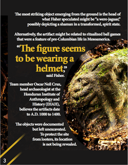
National Geographic has released online an exclusive article about a lost city discovered in the Honduran rain forest. For this assignment the object was to work with typographic elements and the provided content from National Geographic.
Sustainable Packaging Re-design
Fall 2015
Illustrator
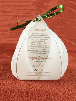
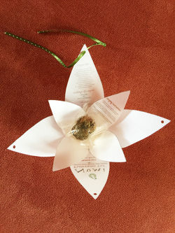
For this assignment we were asked to redesign packaging for an already existing brand with sustainability in mind. I chose Numi because I felt with their flowering tea product, was the opportunity to create a unique package. I created the package, with a self-made template, to literally flower when opened as the product does when steeped. The materials are velum paper, water based inks, and recycled fibers for the ribbon. There is also a recyclable plastic inside which contains the tea leaves. I also tried to incorporate an aspect of usability so that the buyer would want to keep the packaging. For example, the package may be recycled into a small paper lantern to hold tea lights.
The front has the original text logo from Numi, the back has ingredients, the bottom has the necessary scan codes and organic labels, while the inside flower tab contains steeping instructions.
Banner Design
Fall 2016
Photoshop
Prompt: Make something cool.